Saturday, January 12, 2019

The 2 Website Analytics Tools Pros Actually Use in 2019

I personally love data and analytics tools.

But here’s the straight truth: you need a lot less than the analytics industry wants you to believe.

Most experts will try to convince you that you need an analytics tool for everything. More data is always a good thing, right?

I used to believe that myself.

Over the last few years, I’ve changed my stance on the entire analytics category. These days, I prefer to keep things as simple as possible. One or two tools is about all I need. Less infrastructure to worry about, fewer complexities to manage, and an easier system for teams to use and act on.

The Analytics Tools I Use

  • First, I get my main tool in place, which is almost always Google Analytics.
  • If I need a true enterprise product, I use Adobe Analytics.
  • I avoid installing any user analytics tools to start — too much effort required for too little value.

A few extra tools I use for specific projects

  • If you have a lot of user flows to improve, get a heatmap tool. The best is Crazy Egg.
  • If you’re making SEO a priority, get an SEO tool. I use SEMrush, but also like Ahrefs.
  • If you do a lot of conversion optimization and A/B testing, get an A/B testing tool. I recommend Optimizely.
  • Once you’re large enough that it makes sense to consolidate all your data into a single source of truth, get a real business intelligence function built out along with the infrastructure to support it.

Why You Should Trust Me

I’ve spent a decade managing online marketing teams and websites with millions of visitors per month. Part of that time I was the head of marketing at an analytics company: KISSmetrics.

Not to mention the hundreds of companies I’ve consulted for, the analytics certifications I have, and the countless number of reporting and data projects I’ve managed over the years.

Now let’s get to the straight truth on these tools.

Overall Best Website Analytics Tool: Google Analytics

Website Analytics - Google_Analytics Overview Dashboard
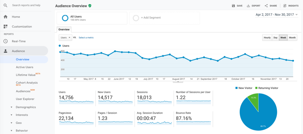
Without a doubt, Google Analytics is the best analytics tool out there.

While working at KISSmetrics, I did a bunch of competitive research on Google Analytics. I’ve also done plenty of Google Analytics consulting over the years.

There are few counter-intuitive insights I’ve learned about Google Analytics along the way.

First, people love Google Analytics. The user satisfaction scores are always sky high. When I saw how happy users were for the first time, it seemed like an insurmountable challenge. Remember, I was working at a competitor.

Here’s the weird part though.

Very few people actually use Google Analytics for anything other than checking the total traffic on their site.

In other words, most people log into Google Analytics, look at one of the basic reports, check to see how many total people visited their site recently, and then log out.

That’s it.

For a long time, I didn’t understand how to reconcile these two facts: People barely use Google Analytics, but they also love it. How can both of these things be true at the same time?

It dawned on me that seeing total site traffic is a huge ego boost. It validates our work. It feels great to see people visiting our sites. It feels so good that we’d be furious if Google Analytics ever shut down.

That feeling is so powerful that people don’t need much else from Google Analytics.

I used to think this was a problem. Look at all that other data! Think of all the other insights that will grow your business! It’s all right there in the other reports!

Now I have a more nuanced understanding.

Realistically, you’ll install Google Analytics and you’ll only use it to check your total traffic. And that’s totally okay. It’s still a major data point for you to run your site and business. Plus, you’ll get the motivational boost that comes from seeing how many people visit your site. If that’s as far as you ever take it, don’t feel guilty — you’re still getting a ton of value from Google Analytics.

If you’re ever in the mood to check a couple of extra reports in Google Analytics, here are two of my favorites that are also easy to understand:

  1. You can see which traffic sources send you traffic. I prefer the Source/Medium report that’s under Acquisition > All Traffic from the sidebar. I like seeing the exact sources that send traffic instead of broad channels, since it’s a bit easier to come up with insights that are worth acting on.
  2. You can see which pages on your site bring you traffic with the Landing Page report. It’s under Behavior > Site Content in the sidebar. Look for patterns in the pages that seem to keep bringing in traffic over time, then ask yourself how you can do more of that.

Those two reports alone will keep me busy for years on end. They’re also easy enough for anyone to use without getting overwhelmed. You can also install a Google Analytics add-on to Google Sheets and manipulate the data there. When you’re ready for more, try out these six advanced moves.

Analytics Tool Alternatives

Best Free Analytics Tool: Also Google Analytics

Not only is Google Analytics the best analytics tool out there, it’s also 100% free. It’s an amazing deal. Google has a reputation for having the best engineering team on the planet and it’s ridiculous that all of us get to take advantage of that expertise with a free tool.

Whenever I build a new site, the first thing I do is install Google Analytics. It’s an ingrained habit.

The only downside to the free Google Analytics plan is its data limit. Once your site gets to a certain size, you’ll notice that Google Analytics will start sampling your reporting. This means the data isn’t 100% accurate because Google Analytics is only reviewing a percentage of your real data, say 75% for example, and is making a prediction on the last 25%. The more data you have, the less “real” data is included in each report. You won’t start to see this until you have hundreds of thousands of visitors per month.

Some folks deeply hate data sampling and consider it a huge problem. These days, I don’t worry about it. It’s a small cost to get access to an analytics tool as high quality as Google Analytics without having to pay a dime. I only get concerned once a site is generating many millions of visits per month and the majority of data starts getting sampled.

Best Enterprise Analytics Tool: Adobe Analytics

At the enterprise level, Adobe Analytics is the de facto winner. Over the years, it’s gone by several names including Adobe SiteCatalyst and Omniture.

It has a very strong reputation in the space and can support the truly enterprise needs like deep customization, implementation support, uptime requirements, and so forth.

In the last few years, Google has pushed into the enterprise space with its Google Analytics 360. If you have a site with serious volume and are already bumping against the free limits of Google Analytics, it might be worth looking at Google Analytics 360.

To decide between Adobe Analytics and Google Analytics 360, I’d ask myself if I simply need more of what I already have with Google Analytics. If I were already getting everything that I wanted and just needed the “enterprise” packaging to unlock higher data volume, more support, service agreements, etc., then I’d go with Google Analytics 360. But if my goal were to seriously uplevel my analytics capabilities beyond Google Analytics, I’d go with Adobe Analytics. It’s a more complete analytics package that extends beyond the website-only focus of Google Analytics.

In most cases, I’d go with Adobe Analytics.

Enterprise Analytics Tool Alternative

Best User Analytics Tool: Amplitude

In the last decade, a new set of user analytics tools have cropped up.

The previous generation of tools, like Google Analytics, focused really heavily on websites and traffic. Those tools were designed solely to get insights on your website.

As the internet evolved, lots of tech businesses needed data focused on users instead of on websites. They needed things like persistent user identities to track users over the long term, funnel reports to see how people moved through their apps, and cohort reports to see how user behavior changed over the long-term.

Companies like KISSmetrics and Mixpanel filled this market need. They were the main competitors in the space for several years. The easiest way to explain the difference between them is that KISSmetrics had the cleanest and highest quality data structure while Mixpanel had easier and cleaner reporting.

Recently, Amplitude jumped into the category and pushed a very generous free plan that includes plenty of tracking volume and lots of the main reports you’d want to use. Most of the competitors now offer substantial freemium plans, largely because Amplitude set the freemium bar so high and they were forced to match it.

Because of its generous freemium plan and the quality of its reporting, we recommend Amplitude if you’re looking for a user analytics tool.

What Happened to KISSmetrics?

This is the analytics company that I worked for and led its marketing team for a period. If you go to the website today, it points to Neil Patel’s website, one of the original co-founders. Needless to say, KISSmetrics is not really considered a competitor these days.

A Word of Caution on User Analytics Tools

User analytics tools are not cheap. Even if you’re on a freemium or modestly priced subscription with one of these tools, that’s only a fraction of what you’ll spend.

First, you’ll spend a ton of time on the install. You will need an engineer and someone else on your team who knows your business, the user flows, and analytics tools pretty well. The implementation support from the tools themselves tends to be poor.

Then there’s the maintenance to keep the tracking up to date. User flows change, products evolve, new organization goals are set. All of that impacts your tracking, which has to be updated regularly in order to keep your data accurate.

And finally, in my experience, very few people in the organization are comfortable using analytics tools. They either stick to one or two basic reports, or avoid the tool entirely. So if you want to get the full value of the tool, you’ll need someone with real talent and skill for pulling reports. This ends up being an analyst or a product/marketing manager who can dedicate a decent amount of their time to reporting. That’s time that could be used elsewhere.

In contrast, tools like Google Analytics are relatively easy to set up. Add the Google Analytics tracking script on every page of your site and you’ll get 80% of the data that you need right away. User analytics tools aren’t nearly as easy to set up and maintain.

This is why I recommend most folks skip the user analytics category entirely — too much effort for too little gain.

User Analytics Alternatives

Best Heatmap Tool: Crazy Egg

Analytics tools give us a ton of information on what’s happening to our websites.

But sometimes…

It’s too much information. Rows and rows of data, hundreds of reports, more metrics than we can every possible understand.

Heatmaps do an amazing job simplifying everything, making it really easy to understand what people are doing. Heatmap reports take one of the pages on your website and show you visually where people are clicking on that page. Within a few seconds, you’ll see exactly what what people click on and what they don’t. In my experience, everyone on the team instantly understands the major insights from a heatmap tool.

Crazy Egg - Website Analytics Heatmap

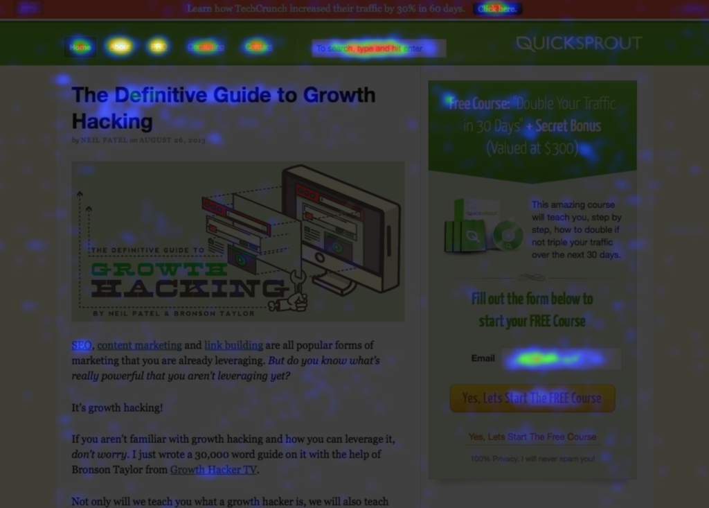
Acting on those insights is pretty easy too. Two simple rules will take you pretty far:

  • For the stuff that people click on the most, do more of that.
  • For stuff that people don’t click on, get rid of it.

A heatmap tool is the easiest and most beginner friendly way to start using analytics to make your sites better. Run a heatmap on the top three more important pages of you site (like your homepage, product page, pricing pages, or sales page) and go through several design iterations using the two rules above. That’ll give you a drastically improved website without a more complicated website analytics setup or analysis.

Heatmaps are also really powerful when you’re trying to improve a bunch of user flows, like an online or mobile app. You can glean tons of valuable insights on what users are trying to do, allowing you to iterate on your user flows and drastically improve them.

We recommend Crazy Egg because the quality of its tool stands out in the category. They have several variations of the heatmap report like confetti, clickmaps, and scroll maps to give you even more insights. The quality of its data and reporting is also top-notch. It was one of the first heatmap tools on the market, and it has added more functionality in the past few years like user recordings and A/B testing.

Heatmap Tool Alternative

Best A/B Testing Tool: Optimizely

Before we get into Optimizely itself, a quick sidenote.

I love love love A/B testing. You could call it my first career passion.

That said, most companies shouldn’t be running A/B tests. That’s right. For the vast majority of companies, A/B testing can be completely ignored.

While A/B testing is a reliable way to improve conversion rates on a website, it requires a ton of data, a lot more than most industry experts recommend.

Otherwise, it takes too much time, too much money, and the impact on the business is too minor for it to be worth it.

If you have lots of data to work with and are ready to take the plunge into A/B testing, I recommend Optimizely. It’s got all the A/B testing features you’ll need, tracks data the most accurately, and is pretty easy to use.

The biggest downside: the price.

Over the last few years, Optimizely has aggressively pursued larger companies as its customers and has largely left small businesses behind. Pricing is no longer listed on the website, a sign that the focus is on enterprise businesses at higher price points. A few years ago, we spent more than $10,000 per year to use the tool.

Optimizely is my go-to choice if you’re at a large company.

If you’re smaller, you’ll need to go another route.

Best A/B Testing Tool for Small Businesses: Crazy Egg

In the past, I would have recommended VWO (formerly Visual Website Optimizer). Like Optimizely, it’s one of the primary A/B testing tools on the market.

Unfortunately, it looks like VWO has begun to pursue an enterprise strategy too. Prices are no longer listed on the site — not a good sign for small businesses. It’s been longer since I’ve used them, so I don’t know what the current pricing is, but it’s safe to assume that it’s too high for a small business.

Crazy Egg has released an A/B testing tool alongside its heatmap reports that’s focused on beginners and businesses that don’t have the resources for an entire team dedicated to A/B testing. Pick a page on your site, make a few edits with Crazy Egg, then get simple data on which version you should keep.

Best SEO Tool: SEMrush

As SEO has evolved, it’s gotten increasingly competitive and data driven. There’s also a host of metrics that are completely unique to search, like keyword rankings, monthly search volume, and backlink volume.

It’s possible to get some of these metrics from Google Analytics but to get everything, you need to sign up for an SEO tool.

My favorite SEO tool is SEMrush.

The biggest reason is SEMrush has the easiest reporting compared to the other SEO tools. It’s perfect for beginning or intermediate SEO marketers.

That said, I’m also a big fan of Ahrefs. It has a ton of depth that advanced SEO marketers will love. But it can be a bit overwhelming at first, especially if you don’t have a deep background in SEO.

I’ve never been a huge fan of Moz. The reporting never clicked with me and I always end up switching back to SEMrush or Ahrefs. If you end up liking the feel of Moz, it is a well-respected tool in the category.

SEO Tool Alternatives

What About Analytics for Paid Marketing Channels?

Google Ads (formerly AdWords), Facebook, and other paid marketing channels need a ton of data to run effective campaigns. Since companies like Google and Facebook have extreme incentives to give you the highest quality data possible, they’ve invested in their own data and reporting. The analytics in Google Ads and Facebook Ads are world-class — you’ll get everything you need.

All you need to do is install a JavaScript snippet on the page of your website that signifies a conversion took place. The page that means you acquired a lead, a sale, or a new user. The JavaScript snippet will tell the ads platform that a conversion occurred, helping you optimize the campaigns for your business. There are other ways to set up conversion tracking, but this is the easiest.

Other paid marketing platforms follow this same format. Reporting and data is built into the ad platform and tracking is handled by installing a JavaScript snippet that logs conversions.

What’s the Difference Between Website Analytics and Business Intelligence?

Website analytics is the online marketing and website data for a business. Business intelligence includes all of the data for a business.

As more and more business data moves into the cloud, the line between these two categories has gotten blurred. CRMs (like Salesforce) now include a lot of marketing and campaign data. The marketing automation tools (like Marketo, HubSpot, Pardot, etc.) that have become a standard part of the marketing infrastructure at many companies produce marketing data too.

Once you get large enough, you’ll want to combine all of these sources into a single database and source of truth for your customers. That’s where business intelligence comes in. It typically involves putting together a data warehouse (Amazon Redshift is a popular choice) with a reporting tool that sits on top of it like Tableau. This approach is very expense, pretty complicated, and difficult to maintain, so only go this route once your business is large enough to truly get value out of it.

In the meantime, integrate your tools with one another whenever you can while keeping things as simple as possible.

Recap: My Analytics Tools Recommendations

To recap, here are my three core recommendations:

“Extra” tools for specific use cases:

  • If you have a lot of user flows to improve, get a heatmap tool like Crazy Egg.
  • If you’re making SEO a priority, get an SEO tool like SEMrush.
  • If you do a lot of conversion optimization and A/B testing, get an A/B testing tool like Optimizely.
  • When you’re large enough, build a real business intelligence function.


from Quick Sprout http://bit.ly/2smPiYZ
via IFTTT

Friday, January 11, 2019

Research finds heavy Facebook users make impaired decisions like drug addicts

Researchers at Michigan State University are exploring the idea that there’s more to “social media addiction” than casual joking about being too online might suggest. Their paper, titled “Excessive social media users demonstrate impaired decision making in the Iowa Gambling Task” (Meshi, Elizarova, Bender, & Verdejo-Garcia) and published in the Journal of Behavioral Addictions, indicates that people who use social media sites heavily actually display some of the behavioral hallmarks of someone addicted to cocaine or heroin.

The study asked 71 participants to first rate their own Facebook usage with a measure known as the Bergen Facebook Addiction Scale. The study subjects then went on to complete something called the Iowa Gambling Task (IGT), a classic research tool that evaluates impaired decision making. The IGT presents participants with four virtual decks of cards associated with rewards or punishments and asks them to choose cards from the decks to maximize their virtual winnings. As the study explains, “Participants are also informed that some decks are better than others and that if they want to do well, they should avoid the bad decks and choose cards from the good decks.”

What the researchers found was telling. Study participants who self-reported as excessive Facebook users actually performed worse than their peers on the IGT, frequenting the two “bad” decks that offer immediate gains but ultimate result in losses. That difference in behavior was statistically significant in the later portion of the IGT, when a participant has had ample time to observe the deck’s patterns and knows which decks present the greatest risk.

The IGT has been used to study everything from patients with frontal lobe brain injuries to heroin addicts, but using it as a measure to examine social media addicts is novel. Along with deeper, structural research, it’s clear that researchers can apply much of the existing methodological framework for learning about substance addiction to social media users.

The study is narrow, but interesting and offers a few paths for follow-up research. As the researchers recognize, in an ideal study the researchers could actually observe participants’ social media usage and sort them into categories of high or low social media usage based on behavior rather than a survey they fill out.

Future research could also delve more deeply into excessive users across different social networks. The study only looked at Facebook use, “because it is currently the most widely used [social network] around the world” but one could expect to see similar results with the billion-plus monthly Instagram and potentially the substantially smaller portion of people on Twitter.

Ultimately, we know that social media is shifting human behavior and potentially its neurological underpinnings, we just don’t know the extent of it — yet. Due to the methodical nature of behavioral research and the often extremely protracted process of publishing it, we likely won’t know the results of studies conducted now for years to come. Still, as this study proves, there are researchers at work examining how social media is impacting our brains and our behavior, we just might not be able to see the big picture for some time.


from Facebook – TechCrunch https://tcrn.ch/2QDOLvE
via IFTTT

Thursday, January 10, 2019

10 Trending 2019 Website Color Schemes

There’s a lot to take into consideration when you’re designing a website: there’s the layout, the architecture, the CTAs, picking your domain name, setting up a host, configuring the backend, picking a theme, perfecting the wording of your value proposition, and deciding which visuals to use. The list goes on and on.

All too often website color scheme is an afterthought.

So many site owners put little to no thought into picking their website color palette, let alone a trending color scheme. They think, How important could website colors really be?

Well, the color choices on your website, and how dated they feel, has a bigger impact on visitors than you might realize.

In fact, research shows that people judge products within 90 seconds of exposure — and 90% of that judgment is based on color alone. Choosing the right colors can enhance readability by 40%, increase comprehension by 73%, and improve learning by 78%.

Colors are one of the most important elements that add credibility to your website. According to HubSpot, 46% of people rank the design of a website the number one factor in determining the credibility of a company.

The University of Toronto conducted an interesting study on colors and how they are perceived by individuals. The results were very intriguing. They determined that most people prefer combinations of simple colors. In most cases, just two or three colors were perceived as appealing. That’s why sticking to a color palette is so important to the success of your site, and ultimately your business.

But there are more than 10 million colors in the world. That’s overwhelming, to say the least. How can you determine which colors are the best for your website?

Whether you have a new site that you’re designing from scratch or an old website that needs a facelift and some improvements, you’ve come to the right place. This guide will show you which site color palettes are trending in 2019, so you can find the best ones for your website. We’ll look at examples of real websites and list some of the exact color codes used for on those sites.

1. Soft tones

Soft tones are definitely trending in 2019. Creations Namale is a jewelry brand based in Canada. Here’s a screenshot from the 2019 look book on the homepage of their website:

neutral color palette for 2019 jewelry business

The colors are soft, classy, and very appealing. It’s a perfect choice for a brand in the fashion industry selling jewelry. The simple tones work well with each other and the jewelry stand outs.

In addition to the simple color scheme used on this site, the layout takes the same approach. The white space lets the page breathe. This will be a common theme as we continue throughout this guide.

As you can see, there is minimal text. Rather than trying to cram as many products as possible onto one page, this site takes the approach of just one at a time.

If you’re interested in using these colors on your website, here are the exact color codes you’ll need:

Grey green and taupe color palette for 2019 websites

As you can see, you need just two or three colors to be appealing to an audience. If this site had used six or seven color tones in the design, the simplicity and trendy effect would be lost.

2. Simple grey, off white, and a pop of red

Let’s continue with the simplicity trend. You don’t need to have lots of busy colors to have an appealing website color scheme. Simple website color palettes are less distracting and allow your audience to focus on what’s important to them. Check out this page from Tareq Portfolio. Tareq Ismail is an experienced designer, so it’s only natural that he chose a powerfully simple design and color scheme for his own website.

modern red grey website colors

This page is a bit different from the previous example. There is more text on the page, but it’s still simple and easy to read. Rather than using a pure white tone, Tareq chose a slightly off-white color to blend with his grey and red color palette. This off-white works well since he’s wearing a white shirt in the image on this page. The subtle hints of red the text really complete the look and take a page that would be otherwise boring and make it pop.

These are the color codes used on Tareq’s site.
grey offwhite and red color palette trend for 2019

This is a great option to consider if you’re looking for a color palette that’s professional, simple, and works well with pages that have bit more text.

3. Gradient blues and greens with white text

Stripe is a payment processing software for Internet businesses. It’s a very popular tool used by ecommerce companies. As a technology brand, Stripe needs to stay up to date with all of the latest tech trends. But they also have a website color scheme that’s trendy as well.

Before we look at what their website looks like today, take a look at what their site looked like six years ago, back in 2013:
Stripe homepage 2013

Is there anything wrong with this design? On the surface, it just looks a little bit boring and dull. There’s nothing about it that’s really visually appealing.

But Stripe made adjustments. It’s current color palette uses a technique that’s been growing in popularity: gradients. Take a look for yourself:

Stripe homepage 2019

Shades of blue. Shades of green. White. Very simple.

By using a gradient scale, Stripe takes a very simple blue color and blends it with different tones. The difference between the 2013 site and the 2019 site is like night and day. Even if you’d seen the two homepages without knowing the years, you’d have been able to identify the newest one.

If your website is currently outdated, and looks more like the Stripe site from 2013, try adding color gradients to give your palette a more modern look.

4. Throwback oranges and red tones

Retro color schemes are making a big comeback in 2019. Lots of top brands are using popular colors from the 80s and 90s on their website. But they are putting a modern twist on them.

It’s a bit of an oxymoron. How can something by retro and modern at the same time?

Let’s look at the Spotify homepage.

Spotify homepage 2019 with retro modern color palette

These orange and red tones have a throwback vibe to them. These are warm colors that give people some nostalgia for their childhood and adolescent years.

Spotify’s polka dot colors are inspired by the 80s and 90s, but the design itself is very trendy and uses gradient scales, which are very current, to blend the colors.

It’s important to make sure you understand who you’re trying to target with your website color schemes. This goes far beyond just picking pink designs for women and blue designs for men. To find a retro color scheme that fits your audience, you can use generational marketing to segment your target audience.

5. Soft pink, bright pink, and jet black

Cowboy differentiates its brand by selling electric bikes on a modern, and very pink, website. Typically, the words “Cowboy” and “pink” don’t normally go hand in hand. But the sleek and trendy design of this website is perfect.

Light pink, hot pink, and black color palette for 2019 websites

The soft pink tones in the background makes the jet black bike stand out and become the center of attention. By adding the brighter pink accents in subtle locations around the page, Cowboy Bike nails the trendy and modern color palette.

Most people would assume that pink would be used to target females. But there is nothing feminine about this website. The product appeals to both genders. It just goes to show you that you can throw certain stereotypes right out of the window when it comes to choosing a color palette for your website.

If you like this design and think that the modern feel would work well for your website, you can use these color codes as a reference when you’re choosing your color scheme:

black and pinks website color palette for 2019

6. Grey, soft yellow, and deep green

The QED Group is a website based in the Czech Republic. They offer services to both companies and individuals to help improve organizational development by applying concepts in psychology and behavioral economics.

It’s safe to say that the business model of the QED Group is very unique. Along those same lines, they implemented some of the latest color palettes on their website as well.

trending grey and brights color palette for website

At first glance, the color palette of their home page is a bit busier than some of the other examples that we’ve looked at so far. But they still pull it off well with this trendy design.

Normally you would think that yellow, green, and purple tones would be difficult to read and hard on the eyes. By using lighter and dull grey tones in the background, they are able to add brighter contrasting colors to the middle silhouette.

If you like the modern look of these soft yellow tones paired with grey and deep green, check out these color codes:

2019 color palette of grey and green

7. A very light touch of earth tone

Modern olive website colors
Konstantopoulos S.A. “Olymp” sells greek olives. Earth tones, especially olive tones, make sense for its website.

The layout and design of this homepage are very simple. It uses a color scheme that’s visually appealing and fits well with the product that’s being sold. The main color choice here is green — olive green, of course. But as you can see, it’s used very sparingly. This is key for getting that modern look with a more classic color palette.

Rather than going overboard with wall to wall saturation of dark greens, the soft grey background adds a more modern and trendy feel to the website. Behind that grey, there are green leaves that are muted, since they are layered behind the design. This technique allows the green text and logo to have a stronger presence on the page.

For a business that sells olives, the earth tones color palette was a great choice. Refer to these green, grey, and light brown color codes to get a similar look on your website.

grey green and olive color palette for modern site in 2019

You can do something similar if your product has an identifiable color: start with the light grey background and darker grey copy color, and add your accent color in sparingly.

8. Lots of red, balanced with muted tones

If you look back at all of the trending website color schemes we’ve covered so far, you’ll notice a popular color that’s rarely used. Red.

That’s because red is one of the most powerful, but challenging colors to use on a website. One way to effectively use read is to use it lightly to give a pop of color to something as small as a few key words in the text.

Another way is to pair more muted colors with red.

website color palette for 2019 red teal

The creative branding agency five/four swung for the fences by using a bright red color on a huge portion of their website.

Red color palette for a creative agency website

The reason why this bright red was so successful is because five/four used muted tones on the rest of their page. If they had decided to go with bright yellow, light blue, and bright orange in addition to this red color, it would have been way too much.

But these soft colors pair perfectly with red. This red works really well for the brand, too. It’s bright, bold, and draws lots of attention to the theme of creativity.

So for those of you who want to go modern and bold with your color scheme, consider using these color codes with red on your website.

Just make sure you don’t go too big with the red. You want to be certain that you have enough of the softer tones to let your page breathe, while still capturing a trendy appearance.

9. Futuristic pastels and primaries

When it comes to choosing a color scheme for your website, it’s a good call to follow in the footsteps of those who have experience in this field. No need to reinvent the wheel.

That’s why this list wouldn’t be complete without an example from Anton & Irene. These are professional designers based in New York. They specialize in all aspects of design, including digital products. Of course they have a modern and trendy color palette on their website.

design agency website color palette 2019

One of the best parts about this website color scheme is the futuristic feel about it. The outfit choices of Anton and Irene are pretty far out.

While this site uses more colors than some of the other examples we’ve seen so far, they are used sparingly, so the page isn’t messy or unappealing.

If you’re looking for an artistic spin for your website color scheme, try using different combinations of these exact colors.

Multicolor palette for 2019 trendy website

10. Black on black on black

We’ve seen some black on nearly every website that we’ve looked at so far. But the black was always used pretty sparingly. It’s usually used for text, as opposed to the main colors or background.

However, that doesn’t mean you can’t use heavy blacks in more abundance for your website color scheme, especially if you use different black tones like these:

triple black website color palette for 2019

Let’s see what happens when you combine these tones. Check out the JY BH homepage. By combining different shades of black, you’ll get the gradient effect, which you saw earlier with some of our other examples. The heavy black gradient gives the site a mysterious look.

example of website with triple black color palette in 2019

This company is a French clothing manufacturer. They sell luxury garments and accessories for both men and women. Just like in fashion, black is a timeless color. It’s been popular for years, and will continue to be popular in 2019.

But if you’re going to go black on your website, use different shades, like the example above. Just one black will look flat and basic.

Conclusion

It’s 2019. That means it’s time for you to ditch the color scheme you were using years ago. It’s important to switch it up because color schemes can impact sales on your website.

Choosing the right website color palette doesn’t have to be hard. To update your website with a look that’s modern, trendy, and unique, you can use any of the palettes in this guide. You can even use some of the exact color codes that we showcased.

What colors schemes are you using on your website now? What will you update them to for 2019?


from Quick Sprout http://bit.ly/2H5G6CC
via IFTTT

Instagram now lets you regram your posts to multiple accounts

Instagram is swaying the balance towards simplicity but away from originality. It’s adding the ability to publish feed posts to different accounts you control at the same time by toggling them on within the composer screen. An Instagram spokesperson confirms this option is becoming available to all iOS users, telling TechCrunch “We are rolling out this feature to provide a better experience for people who often post to multiple accounts.”

This “self regram” could make it easier for businesses, influencers, and regular folks with Instas and Finstas to publish the same meme, promotional image, or other content across their profiles simultaneously instead of having to post on one at a time. But it could also make Instagram’s feed a bit more cookie-cutter, with different audiences of different accounts seeing the same shots and captions. The desire to keep the feed original and personal has been a driving force behind Instagram refusing to add a native regram feature for sharing other people’s feed posts to your audience.

Instagram gives all iOS users the ability to publish a post to several of their own accounts at once

Recontextualizing posts uniquely for different accounts or networks is some of the most common social media guru advice. A personal account might want to publish with a more informal, colloquial and intimate style. A business account might be better off acting generally accessible and adding a call to action. A Finsta, or fake Instagram account people keep on the side for posting more raw content, is free to get a little crazy. An identical one-size-fits-all post might actually be one-size-fits-none. That’s why we’d suggest only using this feature if your different accounts have similar themes and fan bases.

TechCrunch first discovered the feature thanks to a tip from SocialThings founder Zachary Shakked, who says “it could save a tiny bit of time”. Other users including Jay Elaine’s Get Branded also showed off the new feature, as seen above. Once users select a photo or video to post, the Instagram for iOS composer screen for adding captions and tags now includes toggle switches for syndicating the post to your other accounts to which you’re logged in. We’ve asked whether the feature will come to Android (I’d assume so in the future), and Stories (anyone’s guess), but Instagram hasn’t responded. You still can’t regram posts by other people, or your own after you publish.

Instagram is now testing a much more prominent way to import photos from Google Photos on Android

As Instagram grows beyond the 1 billion monthly user mark, it’s working to eliminate friction from content creation wherever it can. Instagram recently began testing a much more prominent shortcut of importing photos from Google Photos on Android. First spotted by mobile researcher and all-star TechCrunch tipster Jane Manchun Wong, the Photos shortcut is now right on the image selection screen for some users instead of being buried within the Other folder of your albums. An Instagram spokesperson confirmed that “We are only testing this on Android. You have been able to share to feed from Google photos on Android before but the ability to do so was hidden behind a couple of different steps so we’re up-leveling that ability to make it easier.”

Simplifying publishing sounds obviously better, but it could also dilute the quality of Instagram. Luckily, the feed’s algorithm can simply demote generic content that doesn’t resonate with people. But if the feed becomes full of stale cross-posted promotional spam, it could send younger users fleeing towards the next generation of social apps trying to spice it up.


from Facebook – TechCrunch https://tcrn.ch/2SMR5SE
via IFTTT